

1.Layout?
CSS page layout techniques allow us to take elements contained in a web page and control where they're positioned relative to the following factors: their default position in normal layout flow, the other elements around them, their parent container, and the main viewport/window.
On the early days of css history these were widely used
grid
floats
positioning
Later Flexbox was introduced😎
2.Why Flexbox?
For a long time, CSS layouts were created using floats and positioning. These work, but in some ways they're also limiting and frustrating .That is why flexbox was introduce.
3.How Flexbox works?
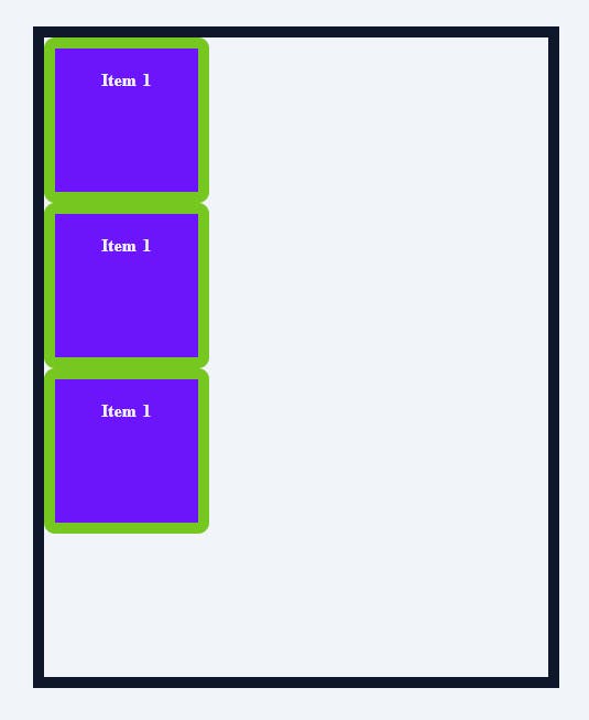
step1: To use a flexbox we need a container and children in html
 <div class="container">
      <div class="item item-1">Item 1</div>
      <div class="item item-2">Item 1</div>
      <div class="item item-3">Item 1</div>
 </div>
Before FlexBox output
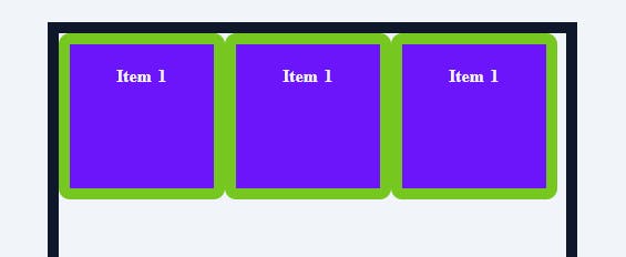
If we need make a container with items as flexbox,then make that container as
.container{
    display:flex;
}
After Flexbox output
4.Flexbox Architecture
Now this creates two invisible axis , A main axis and a cross Axis
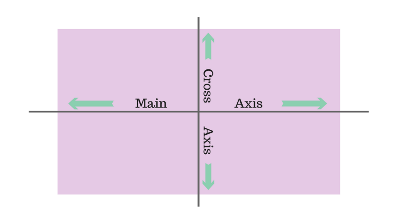
By default display:flex place our item in main axis (horizontally)
5.Flexbox Property
Now to change the main axis to cross axis or to verticall alignmnent use
flex-direction:column; // this align vertically
flex-direction:row;  // this is by-deafult to main-axis
1.flex-direction: It sets the direction of the flex container's main axis and specifies how the children will be placed inside the parent container.
Syntax:
flex-direction: attribute value
Attribute Values:
row: Flex items are displayed horizontally along a row.
column: Flex items are displayed vertically along a column.
row reverse: Flex items are displayed horizontally along a row but in reverse order.
column reverse: Flex items are displayed vertically along a column but in reverse order.
2.justify-content: It defines how items are positioned along the main of the current line.
Syntax:
justify-content: attribute value
Attribute values:
flex-start (default): Flex items are positioned towards the start line of the container.
flex-end: Flex items are placed at the end of the container.
centre: Flex items are positioned in the centre line of the container.
space-between: Flex items are distributed evenly, the first item will be at the start line and the last item will be at the end line of the container.
space-around: Flex items are distributed evenly, with half the amount of space at the start of the first item and the end of the last item.
space-evenly: Flex items are evenly distributed within the alignment container along the main axis.
3.align-items: It defines how flex items will be aligned along the cross-axis of the current line of the container (perpendicular to the main axis). You can think of align-items , as the justify-content version for the cross-axis (perpendicular to the main axis).
Syntax:
align-items: stretch|center|flex-start|flex-end|baseline|initial| inherit;
Attribute Values:
stretch(default): The items stretch to fill the container
flex-start: Items are aligned along the cross-start line.
flex-end: Items are aligned along the cross-end line.
centre: The items are centred on the cross-axis.
baseline: The items are aligned in a line in such a matter that their baselines align.
4.flex-wrap: It specifies whether the flex container will have a single line or be wrapped onto multiple lines.
Syntax:
flex-wrap: attribute value
Attribute values:
no-wrap(default): It specifies that the flex items will not wrap and will be laid out in a single line. which may cause an overflow in the container.
wrap: It specifies that the flex items should l wrap if necessary, and will be laid out in multiple lines.
wrap-reverse: It is the same as a wrap, but the flex items will wrap in reverse order in this case.
5.align-content: When there is extra space in the cross-axis, align-content aligns multiple lines within the container. It is similar to justify-content which aligns individual items within the main axis.
Note: this property has no effect when the flexbox has only a single line.
Syntax:
align-content: attribute value
Attribute values:
flex-start: Lines are aligned towards the beginning of the container.
flex-end: Lines are aligned towards the end of the container.
centre: Lines are aligned towards the centre of the container.
space-between: Lines are evenly distributed, the first item will be at the start and the last item will be at the end of the container.
space-around: Lines are evenly distributed, with half the amount of space at the start of the first item at the end of the last item.
stretch(default): Line stretches to take up the remaining space.
<!-- Some other properties are mentioned below --!>
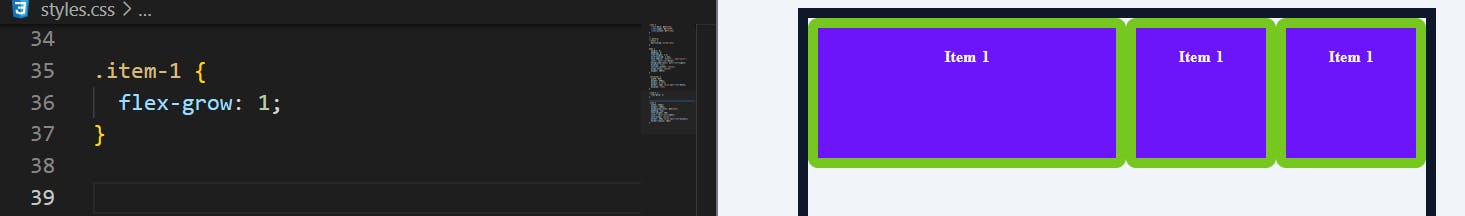
1.Flex-grow - It defines the ability of a flex item to grow if necessary.
2.Flex-shrink - This defines the ability of a flex item to shrink if necessary.
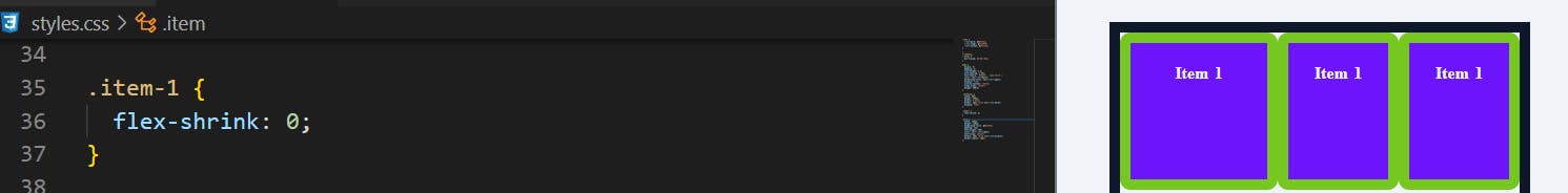
item refuse to shrink when given 0
3.Flex-basis - This specifies the initial size of the flex item.
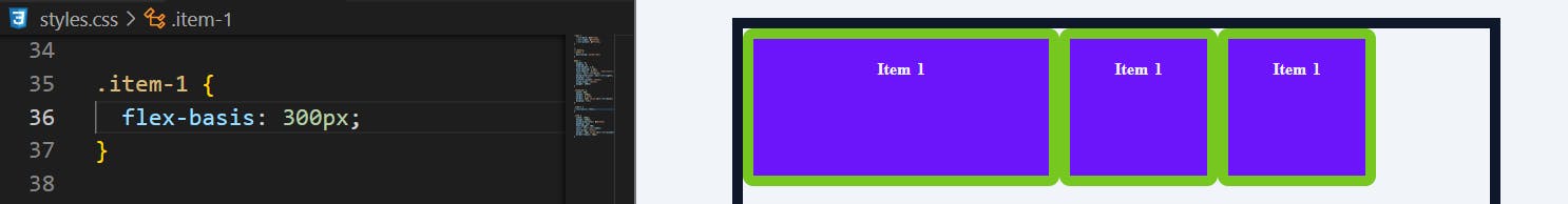
also:flex-basis:auto & flex-basis:0
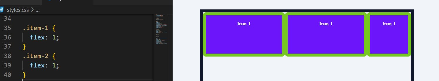
4.Flex - This is a combination of flex-grow, flex-shrink and flex-basis properties
This is the most used one
6.OUTRO
- flex-box is used to create a flexible and responsive layout inside a container. In there they can be aligned either vertically or horizontally